toolbarbutton
Purpose
The behave of Toolbarbutton is similar to the button except the appearance is different. The button component uses HTML BUTTON tag, while the toolbarbutton component uses HTML DIV tag.A toolbarbutton could be placed outside a toolbar. However toolbarbuttons change their appearance if they are placed inside a toolbar.Examples
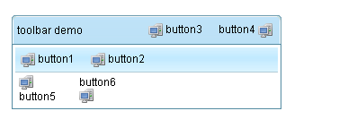
<z:window title="toolbar demo" border="normal" width="300px">
    <z:caption>
        <z:toolbarbutton label="button3" image="/img/computer.png"/>
        <z:space/>
        <z:toolbarbutton label="button4" image="/img/computer.png" dir="reverse"/>
    </z:caption>
    <z:toolbar>
        <z:toolbarbutton label="button1" image="/img/computer.png"/>
        <z:space/>
        <z:toolbarbutton label="button2" image="/img/computer.png"/>
    </z:toolbar>
    <z:hbox>
        <z:toolbarbutton label="button5" image="/img/computer.png" orient="vertical"/>
        <z:space/>
        <z:toolbarbutton label="button6" image="/img/computer.png" orient="vertical" dir="reverse"/>
    </z:hbox>
</z:window>
Description
Attributes
dir (optional) - Sets the direction to layout image. see moredisabled (optional) - Sets whether it is disabled. see moreorient (optional) - Sets the orient to layout image. see moretabindex (optional) - Sets the tab order of this component. see morehref (optional) - Sets the href. see moreautodisable (optional) - Sets a list of component IDs that shall be disabled when the user clicks this button. To represent the button itself, the developer can specify self. see moreupload (optional) - Sets the JavaScript class at the client to handle the upload if this button is used for file upload. Default: null. see moretype (optional) - Sets the button type. Default: "button". It is meaningful only if it is used with a HTML form. Refer to HTML Button Type for details. see moretarget (optional) - Sets the target frame or window. see moresrc (optional) - Deprecated. As of release 3.5.0, it is redudant since it is the same as setImage(java.lang.String) see morehoverImage (optional) - Sets the image URI. The hover image is used when the mouse is moving over this component. Calling this method implies setHoverImageContent(null). In other words, the last invocation of setHoverImage(java.lang.String) overrides the previous setHoverImageContent(org.zkoss.image.Image), if any. see moreimage (optional) - Sets the image URI. Calling this method implies setImageContent(null). In other words, the last invocation of setImage(java.lang.String) overrides the previous setImageContent(org.zkoss.image.Image), if any. see morelabel (optional) - Sets the label. If label is changed, the whole component is invalidate. Thus, you want to smart-update, you have to override this method. see morecontext (optional) - Sets the ID of the popup ( Popup) that should appear when the user right-clicks on the element (aka., context menu). An onOpen event is sent to the context menu if it is going to appear. Therefore, developers can manipulate it dynamically (perhaps based on OpenEvent.getReference) by listening to the onOpen event. Note: To simplify the use, it not only searches its ID space, but also all ID spaces in the desktop. It first searches its own ID space, and then the other Id spaces in the same browser window (might have one or multiple desktops). (since 3.0.2) If there are two components with the same ID (of course, in different ID spaces), you can specify the UUID with the following format: uuid(comp_uuid) see morepopup (optional) - Sets the ID of the popup ( Popup) that should appear when the user clicks on the element. An onOpen event is sent to the popup menu if it is going to appear. Therefore, developers can manipulate it dynamically (perhaps based on OpenEvent.getReference) by listening to the onOpen event. Note: To simplify the use, it not only searches its ID space, but also all ID spaces in the desktop. It first searches its own ID space, and then the other Id spaces in the same browser window (might have one or multiple desktops). (since 3.0.2) If there are two components with the same ID (of course, in different ID spaces), you can specify the UUID with the following format: uuid(comp_uuid) (since 3.6.3) the popup can be shown by a position from Popup.open(org.zkoss.zk.ui.Component, String) or the location of x and y, you can specify the following format: id, position id, position=before_start id, x=15, y=20 uuid(comp_uuid), position uuid(comp_uuid), x=15, y=20 see morectrlKeys (optional) - Sets what keystrokes to intercept. The string could be a combination of the following: see moretooltip (optional) - Sets the ID of the popup ( Popup) that should be used as a tooltip window when the mouse hovers over the element for a moment. An onOpen event is sent to the tooltip if it is going to appear. Therefore, developers can manipulate it dynamically (perhaps based on OpenEvent.getReference) by listening to the onOpen event. Note: To simplify the use, it not only searches its ID space, but also all ID spaces in the desktop. It first searches its own ID space, and then the other Id spaces in the same browser window (might have one or multiple desktops). (since 3.0.2) If there are two components with the same ID (of course, in different ID spaces), you can specify the UUID with the following format: uuid(comp_uuid) (since 3.6.3) the tooltip can be shown by a position from Popup.open(org.zkoss.zk.ui.Component, String) or the location of x and y, and can be specified with a delay time (in millisecond), you can specify the following format: id, position id, position=before_start, delay=500 id, x=15, y=20 uuid(comp_uuid2), position uuid(comp_uuid), x=15, y=20 see moreclass (optional) - Sets the CSS class. This method is a bit confused with Java's class, but we provide it for XUL compatibility. The same as setSclass(java.lang.String). see moreleft (optional) - Sets the left position. If you want to specify right, use setStyle(java.lang.String) instead. For example, setStyle("right: 0px"); see moretop (optional) - Sets the top position. If you want to specify bottom, use setStyle(java.lang.String) instead. For example, setStyle("bottom: 0px"); see morezIndex (optional) - Sets the Z index. see morezindex (optional) - Sets the Z index. see moreheight (optional) - Sets the height. If null, the best fit is used. see moretooltiptext (optional) - Sets the text as the tooltip. see morezclass (optional) - Sets the ZK Cascading Style class(es) for this component. It usually depends on the implementation of the mold (@{link #getMold}). see moresclass (optional) - Sets the CSS class. see moredraggable (optional) - Sets "true" or "false" to denote whether a component is draggable, or an identifier of a draggable type of objects. The simplest way to make a component draggable is to set this attribute to true. To disable it, set this to false. If there are several types of draggable objects, you could assign an identifier for each type of draggable object. The identifier could be anything but empty. see moredroppable (optional) - Sets "true" or "false" to denote whether a component is droppable, or a list of identifiers of draggable types of objects that could be droped to this component. The simplest way to make a component droppable is to set this attribute to true. To disable it, set this to false. If there are several types of draggable objects and this component accepts only some of them, you could assign a list of identifiers that this component accepts, separated by comma. For example, if this component accepts dg1 and dg2, then assign "dg1, dg2" to this attribute. see morefocus (optional) - Sets focus to this element. It is same as focus(), but used to allow ZUML to set focus to particular component. <textbox focus="true"/> see morerenderdefer (optional) - Sets the number of milliseconds before rendering this component at the client. Default: -1 (don't wait). This method is useful if you have a sophiscated page that takes long to render at a slow client. You can specify a non-negative value as the render-defer delay such that the other part of the UI can appear earlier. The styling of the render-deferred widget is controlled by a CSS class called z-renderdefer. Notice that it has no effect if the component has been rendered at the client. see morevflex (optional) - Sets vertical flexibility hint of this component. Number flex indicates how this component's container distributes remaining empty space among its children vertically. Flexible component grow and shrink to fit their given space. Flexible components with larger flex values will be made larger than components with lower flex values, at the ratio determined by all flexible components. The actual flex value is not relevant unless there are other flexible components within the same container. Once the default sizes of components in a container are calculated, the remaining space in the container is divided among the flexible components, according to their flex ratios. Specify a flex value of negative value, 0, or "false" has the same effect as leaving the flex attribute out entirely. Specify a flex value of "true" has the same effect as a flex value of 1. Special flex hint, "min", indicates that the minimum space shall be given to this flexible component to enclose all of its children components. That is, the flexible component grow and shrink to fit its children components. see morehflex (optional) - Sets horizontal flex hint of this component. Number flex indicates how this component's container distributes remaining empty space among its children horizontally. Flexible component grow and shrink to fit their given space. Flexible components with larger flex values will be made larger than components with lower flex values, at the ratio determined by all flexible components. The actual flex value is not relevant unless there are other flexible components within the same container. Once the default sizes of components in a container are calculated, the remaining space in the container is divided among the flexible components, according to their flex ratios. Specify a flex value of negative value, 0, or "false" has the same effect as leaving the flex attribute out entirely. Specify a flex value of "true" has the same effect as a flex value of 1. Special flex hint, "min", indicates that the minimum space shall be given to this flexible component to enclose all of its children components. That is, the flexible component grow and shrink to fit its children components. see morewidth (optional) - Sets the width. If null, the best fit is used. see morestyle (optional) - Sets the CSS style. see moreaction (optional) - Sets the client-side action (CSA). Default: null (no CSA at all) The format: action1: action-effect1; action2: action-effect2 Currently, only two actions are show and hide. They are called when the widget is becoming visible (show) and invisible (hide). The action effect (action-effect1) is the name of a method defined in zk.Actions, such as show: slideDown; hide: slideUp You could specify the effects as follows: show: slideDown({duration:1000}) Security Tips: the action is not encoded and it is OK to embed JavaScript, so, if you want to allow users to specify the action, you have to encode it. Note for developers upgraded from ZK 3: CSA's format is different and limited. In additions, it is part of HtmlBasedComponent. see moreid (optional) - Description copied from interface: Component Sets the ID. The scope of uniqueness depends on whether this component is a root component. Refer to Component.getId() for more details. Default: "" (an empty string; it means no ID at all). see moremold (optional) - Description copied from interface: Component Sets the mold to render this component. see morewidgetClass (optional) - Description copied from interface: Component Sets the widget class (aka., the widget type). The widget class is a JavaScript class, including the package name. For example, "zul.wnd.Window". see morestubonly (optional) - Description copied from interface: Component Sets whether this component is stub-only. By stub-only, we mean we don't need to maintain the states of the component at the server side. Default: "inherit" (i.e., the same as the parent's stub-only, and "false" is assumed if none of parents is specified with stub-only). If a component is set to stub-only, the application running at the server shall not access it anymore after renderred to the client. The ZK loader will try to minimize the memory footprint by merging stub-only components and replacing with light-weight components. However, the event listeners and handlers are preserved, so they will be invoked if the corresponding event is received. Since the original component is gone, the event is the more generic format: an instance of Event (rather than MouseEvent or others). If a component is stub-only, the application usually access it only at the client since all widgets are preserved at the client (so are events). This method is available only for ZK EE. see moredefinition (optional) - Description copied from interface: ComponentCtrl Sets the component definition by specifing the name. see morevisible (optional) - Description copied from interface: Component Sets whether this component is visible. see more
ZK Official Reference
Component Reference
Show toolbarbutton Component ReferenceJava API
Show toolbarbutton Java API